svelte.dev: A complete overhaul
The new site comes with accessibility fixes, new features and bottom navbar
When the initial version of Svelte v3 was released four years ago, it included the single-page documentation that folks have been familiar with. That documentation structure had stayed the same as Svelte's API surface increased steadily and more details were added. As a result, the single page got larger and larger to the point where it was becoming difficult to find things. The community had been asking for a revamp, and now it's here!
Meet the new svelte.dev — a complete overhaul of the old website.
Multi-page docspermalink
The table of contents had grown to be quite large and you had to scroll across half a dozen screens to see the whole thing. We heard you! The docs are all split up into multiple pages now and all pages list their sections in the righthand sidebar.
All modules exposed by Svelte are also listed in the sidebar under the Runtime section:
svelte/compiler is under Compiler and API section
We've also taken extra care to ensure that all the links from the old website will be redirected to the correct new page.
Searchpermalink
The lack of search functionality could make finding stuff a nuisance as Ctrl+F only returns results in order of occurrence and not order of importance. While Ctrl+F did have its benefits such as not requiring JS, now that the site has multiple pages, it's not an option anymore.
And for that, the new website comes with a search bar, which searches through the docs and the API surface. Hit Ctrl+K (or CMD+F for Mac users) and start searching — it even works without JavaScript!
Lights, TypeScript, Action!permalink
The new website comes with a JavaScript / TypeScript toggle, so you can view the docs in your preferred flavour. Every module's exported types are listed at the bottom of the page for easy reference. The types are automatically generated from Svelte's source code, so they're always up to date.
All the JavaScript and TypeScript code snippets have type hints available. Just hover over the variable to see its type. This allows the docs to be type checked at build time, which ensures they're never out of date.
We also (finally!) added documentation for Actions. Svelte Actions are a way to interact with the DOM, and are a great way to add interactivity to your app. The docs for Actions are also available in TypeScript.
<script lang="ts">
  import type { Action } from 'svelte/action';

  const foo: Action = (node) => {
    // the node has been mounted in the DOM

    return {
      destroy() {
        // the node has been removed from the DOM
      }
    };
  };
</script>

<div use:foo />
Dark modepermalink
After many years of users asking for dark mode on the website so they can read the docs for their night-time coding sessions, we finally added it! The website now has a dark mode toggle, which is also synced with your OS's dark mode settings. It can be toggled from the top navbar (bottom navbar on mobile).
Updated REPLpermalink
The REPL has been rewritten from scratch to be fully typesafe and comes with features like dark mode. It was reimplemented to upgrade to CodeMirror 6 which comes with many accessibility improvements, multi-select mode, performance improvements, tree-shaking, and many more features.
Redesigned homepagepermalink
Is it a website redesign if the homepage doesn't get the same amount of love? 🙃
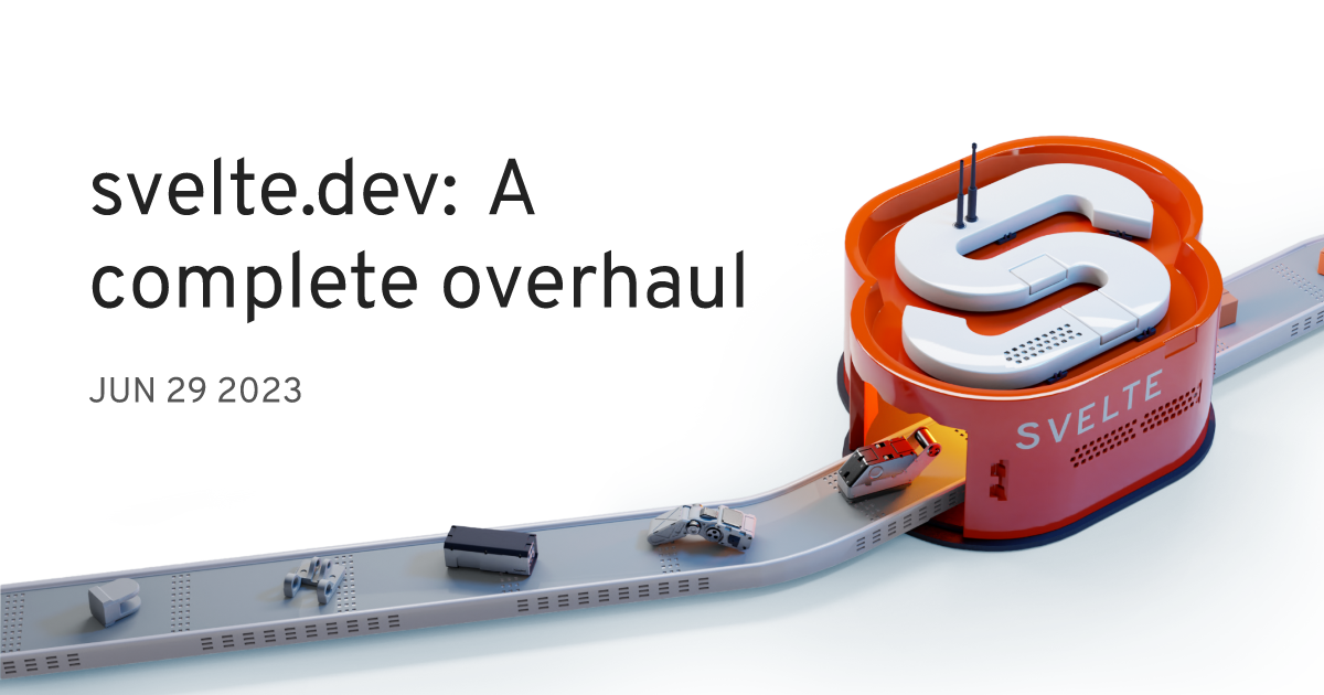
The homepage has also been updated to align with kit.svelte.dev and features the beautiful Svelte Machine by @vedam.
Bottom navigation!permalink
We sent out a tweet about experimenting with bottom navigation bar on mobile rather than the conventional top navbar. The response was overwhelmingly positive, so we went ahead and added it! This makes it easier to navigate the website on mobile with just one hand. We also made sure that you'll get to where you want with as few interactions as possible. If you're in the docs section of the site, you'll likely want to browse other documentation pages, which is why the navbar will show these by default when opening it with the option to go one level up to the general site navigation.
If you're on mobile, you can already see it at the bottom. If you're on desktop, you can see it by resizing your browser window to a smaller size.
Unification of Svelte websitespermalink
Now svelte.dev, kit.svelte.dev, and learn.svelte.dev all use the same design system and are more consistent with each other. This makes it easier to navigate between the websites and also makes it easier to maintain them. We have a package shared across the sites called @sveltejs/site-kit, which went through rigorous changes over last 4 months as we have been moving all common code into this package.
For example, we implemented the dark mode toggle in @sveltejs/site-kit. We then simply updated the package on learn.svelte.dev and kit.svelte.dev and those sites got the dark mode toggle automatically (this is also the reason why those sites got the dark mode toggle before the svelte.dev relaunch).
What's nextpermalink
We have many more things planned to do post-launch. Some of them are:
- Redesigned blog page
- Improved search
- Playground: a unified REPL and Examples page
- Unify the infrastructure of the Svelte REPL and learn.svelte.dev by creating a webcontainer-based REPL with rollup as a fallback
- Address any feedback
